The Wildlands
Art Direction
Branding
UX/UI Design
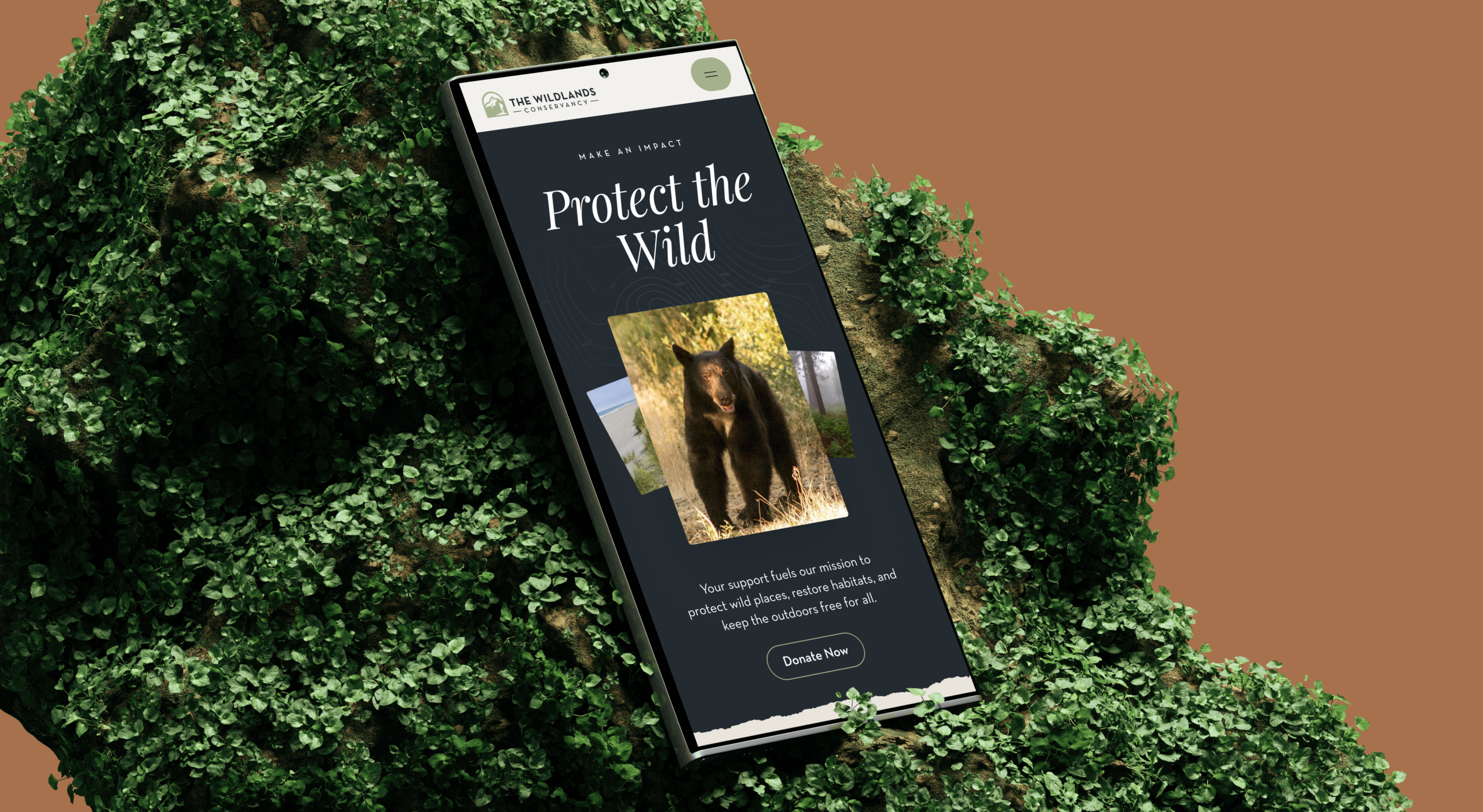
A digital-first identity for The Wildlands Conservancy — the legacy mark simplified, a tactile interface, photography out front.
Digital-First Brand Identity
Tactile, Nature-Built UI
Scalable Brand System
The Wildlands Conservancy protects some of the most dramatic landscapes in the West, but the old site showed almost none of it — dated layouts, crowded pages, very little photography. The redesign started from a simple premise: let the land carry the brand.
The new identity builds on the legacy mark instead of replacing it.
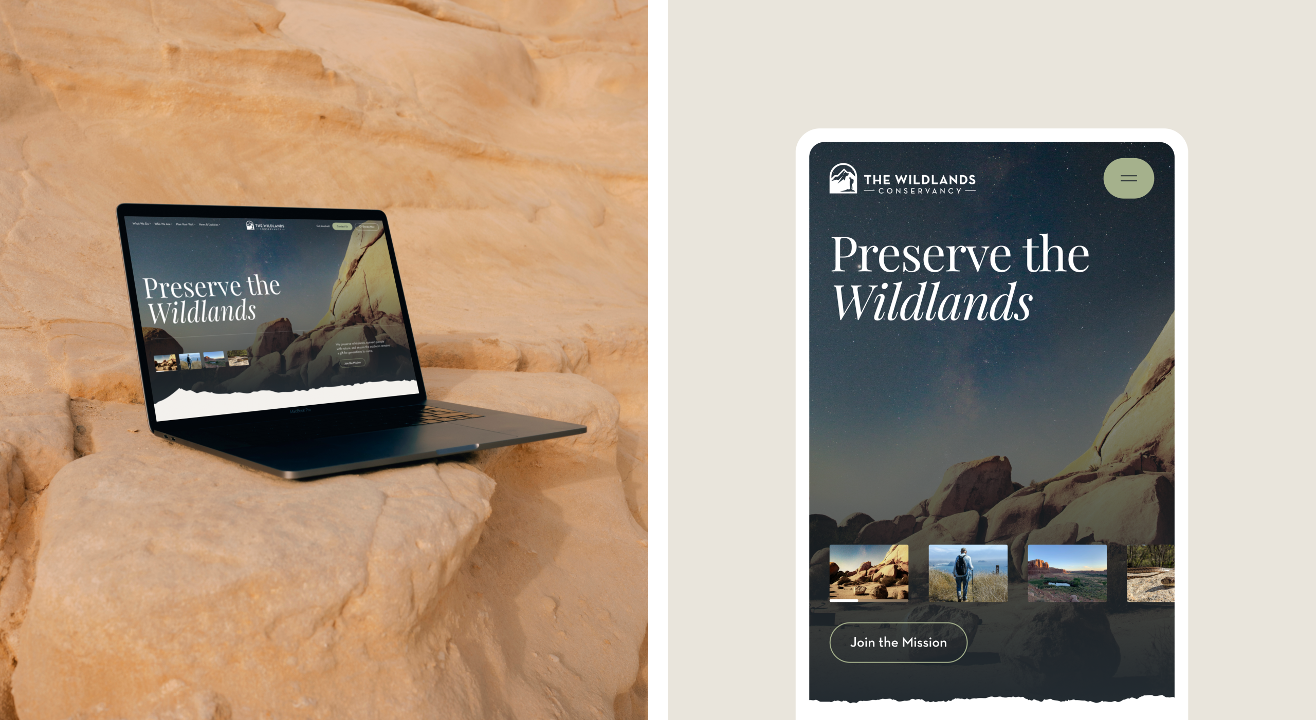
The original motif — a figure taking in the mountain — stayed, simplified into a flatter, single-weight mark that holds at small sizes. The palette was rebuilt around the legacy colors with an extended range for digital use.
The visual direction leans national park rather than nonprofit brochure.
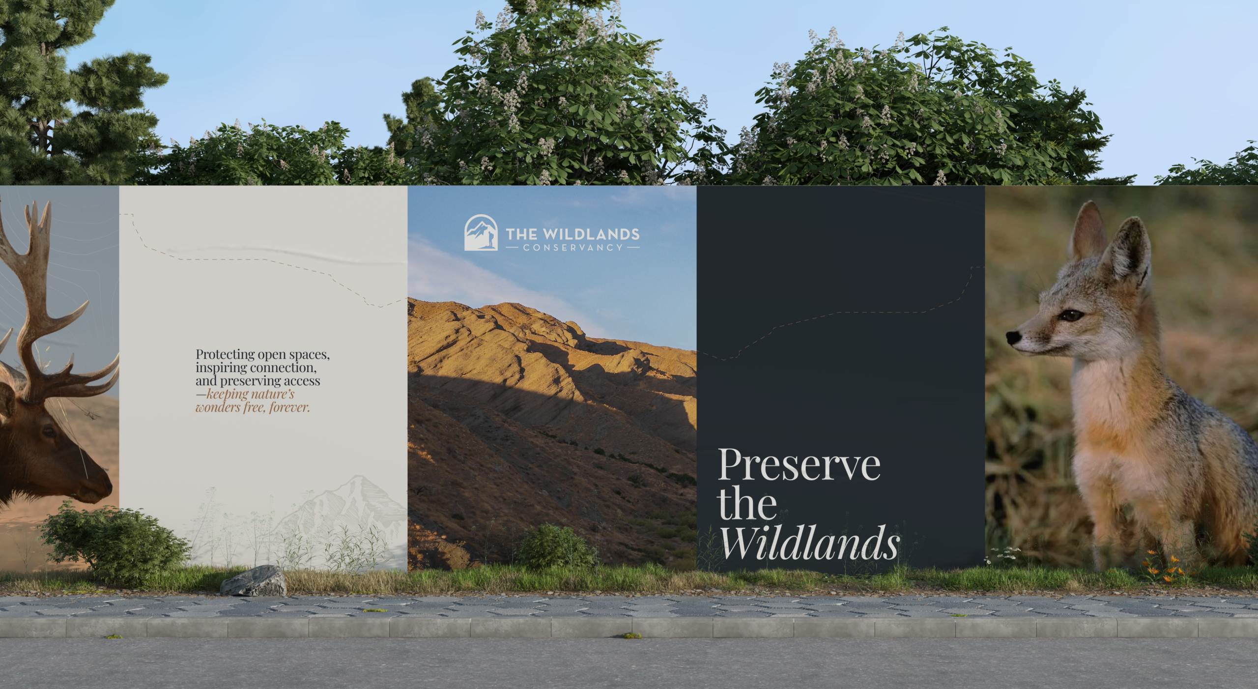
Texture carries the atmosphere: grain in the canvas, hand-drawn illustration, interface details that feel physical rather than flat. Photography takes the lead on every page, sized to open sections rather than support them.
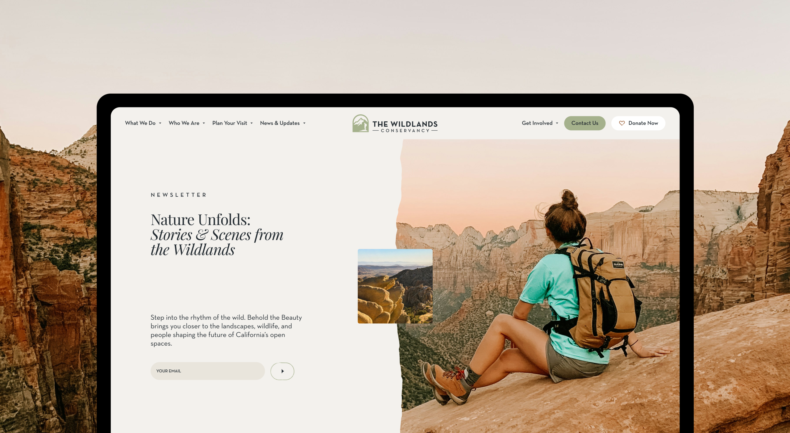
The system holds up across screens, print, and apparel.
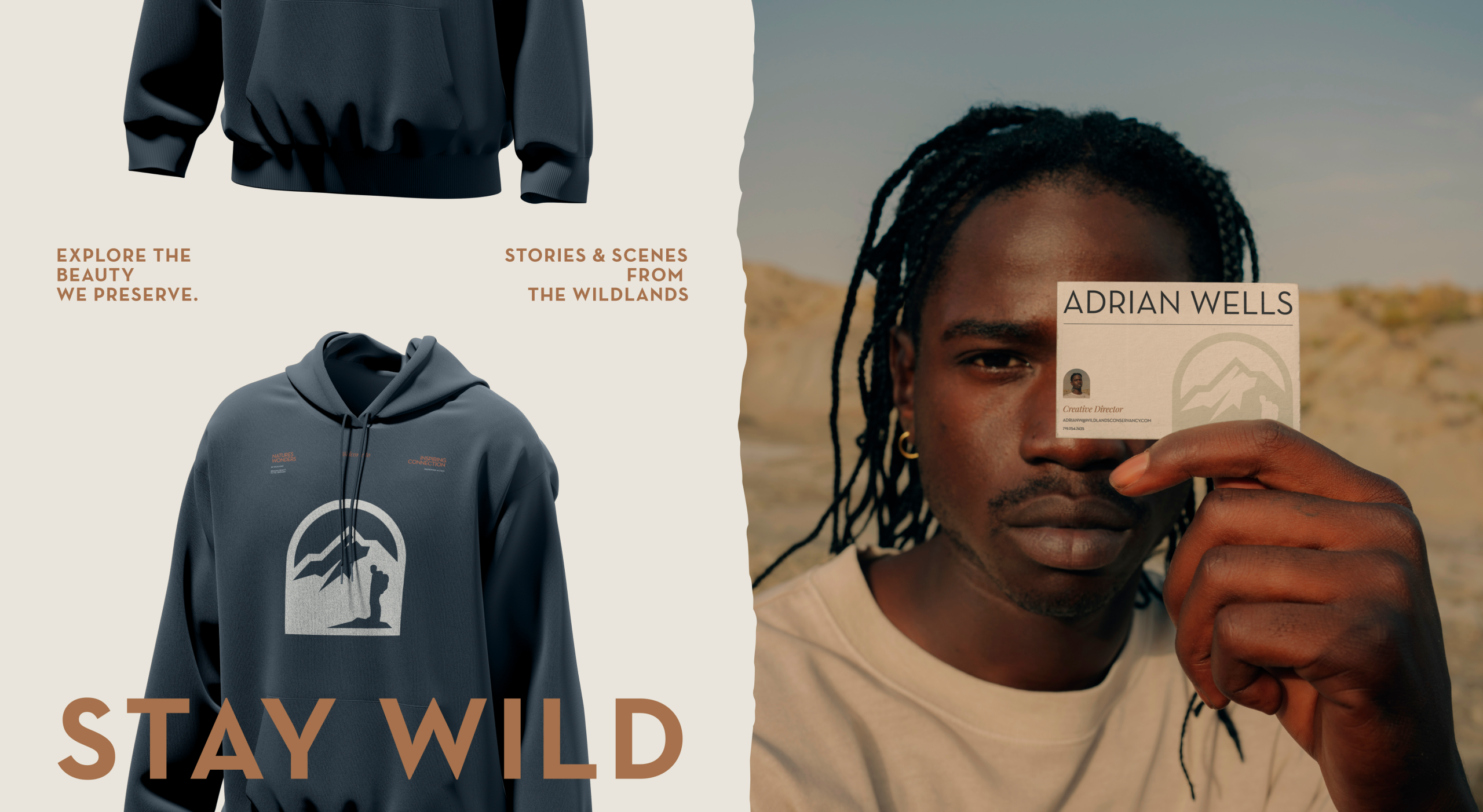
The split is deliberate: the legacy mark stays with land-facing materials, and the simplified mark carries everything with a screen. Guidelines cover both, so when the conservancy extends the identity into the physical world, the groundwork is already done.