Laura’s House
Art Direction
UX/UI Design
A trauma-informed redesign for Laura’s House — urgent support up front, art direction that keeps it human.
Urgent-Help User Journeys
Warm, Trauma-Informed Art Direction
Clear Paths for Every Audience
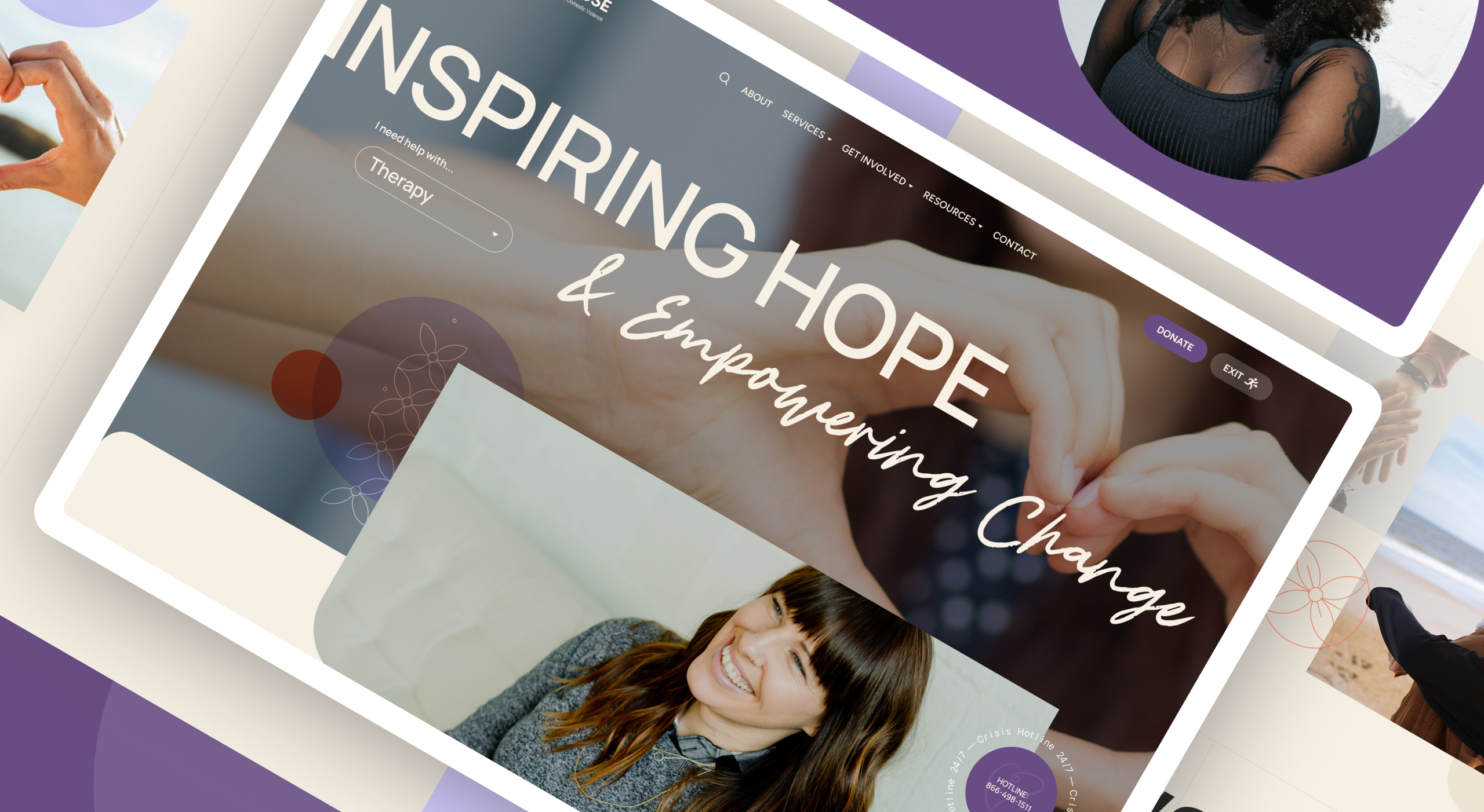
Laura’s House serves people in moments of urgency, and it also serves donors, volunteers, educators, and community partners. The redesign focused on two things: clear paths to support, and art direction warm enough that seeking help doesn’t feel clinical.
Urgent help is visible before anything else.
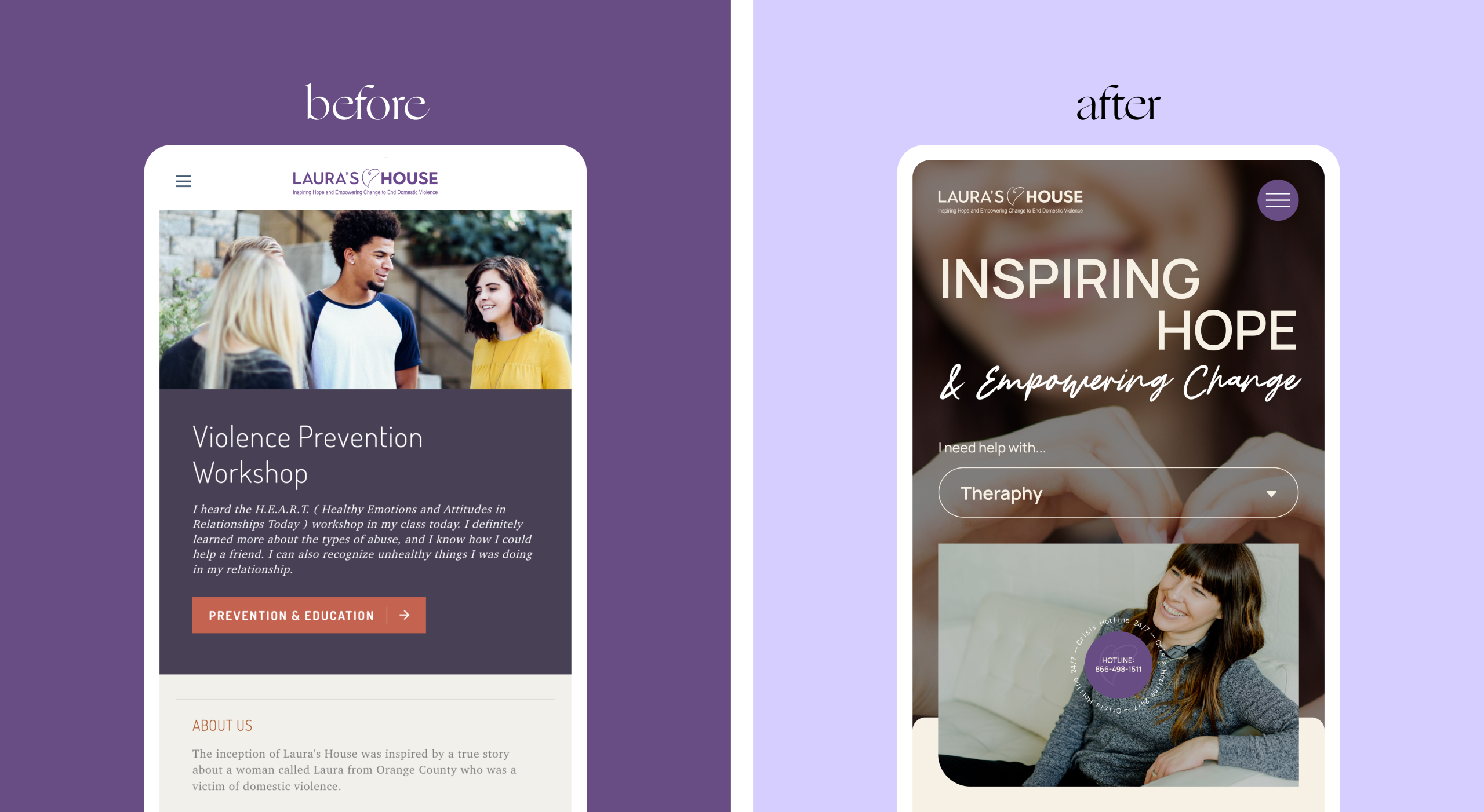
Navigation is organized by intent: direct pathways to shelter, therapy, and legal advocacy sit first; education, volunteering, donations, and events hold the broader structure. Someone arriving in a hard moment gets direction immediately.
The photography carries the warmth of the site.
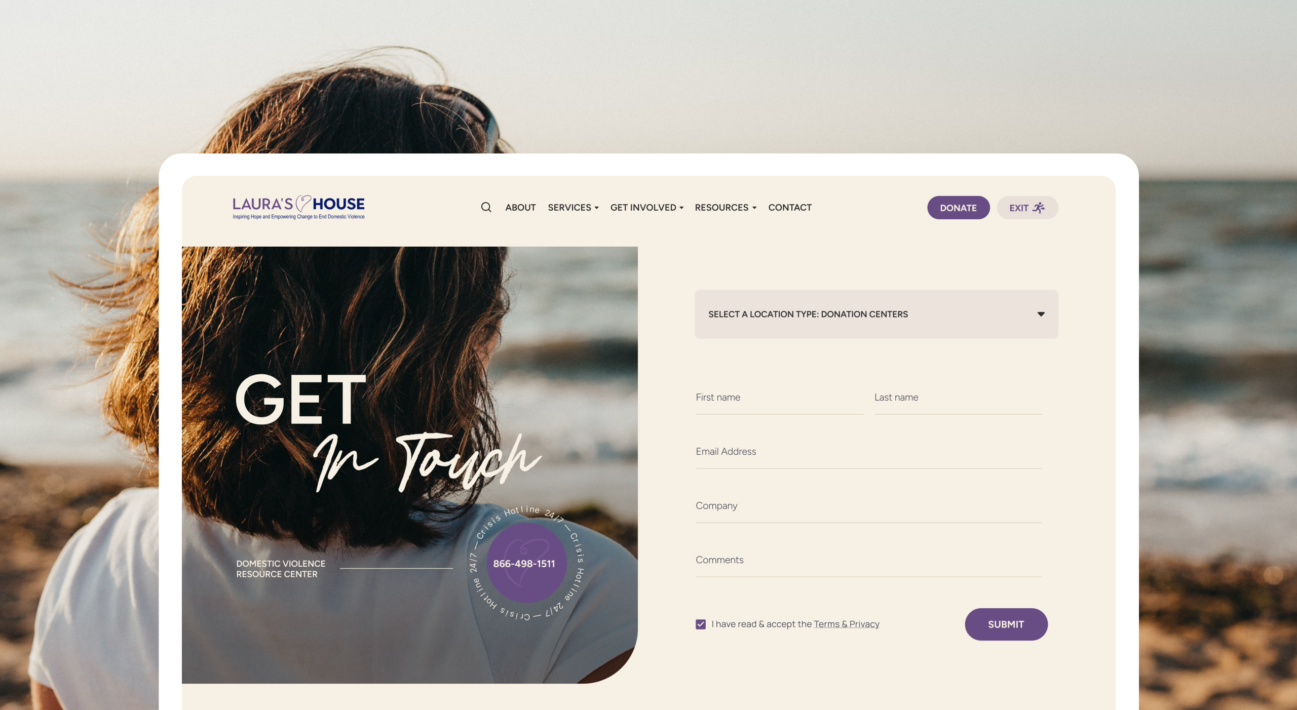
The original site had almost no photography of people. That became the priority — imagery chosen to comfort rather than decorate — and the brand grew around it: an extended color palette, refreshed typography, and decorative elements that keep the pages feeling warm.