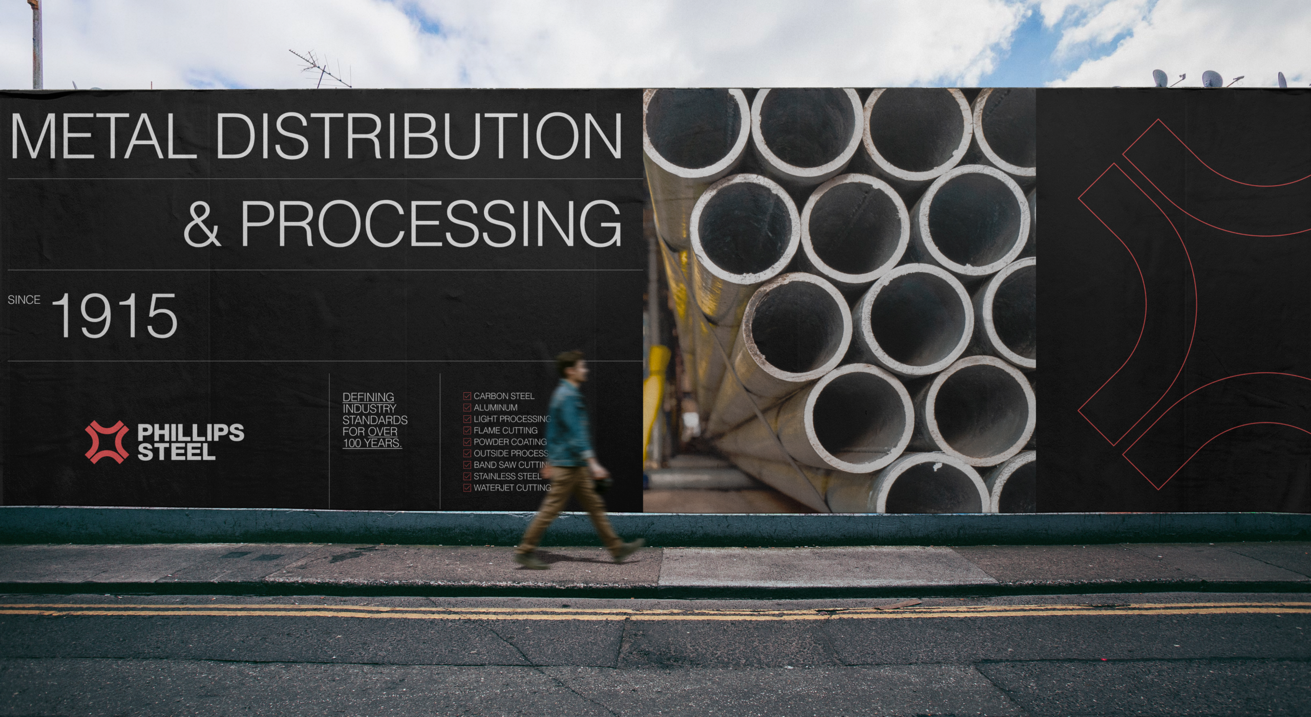
Phillips Steel
Art Direction
Branding
A ground-up identity for a Southern California steel supplier operating since 1915 — industrial, minimal, built to last.
Dual-Read Industrial Mark
Modernized Heritage Palette
Timeless Industrial System
Phillips Steel has supplied Southern California since 1915 — a century of credibility its branding no longer matched. The name still carried weight in the industry; the look around it had gone dated, underselling the scale the business had grown into.
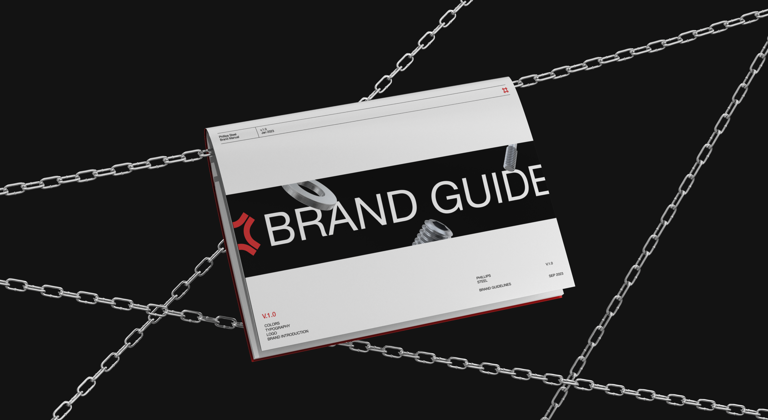
The heritage was the asset. The dated look was the liability.
The mark had to carry the whole system, so it works on a double read: a Phillips-head screwdriver — the obvious nod to the name — that also reads as four steel pipe cross-sections seen head-on. One symbol doing two jobs, both of them true to what they make.
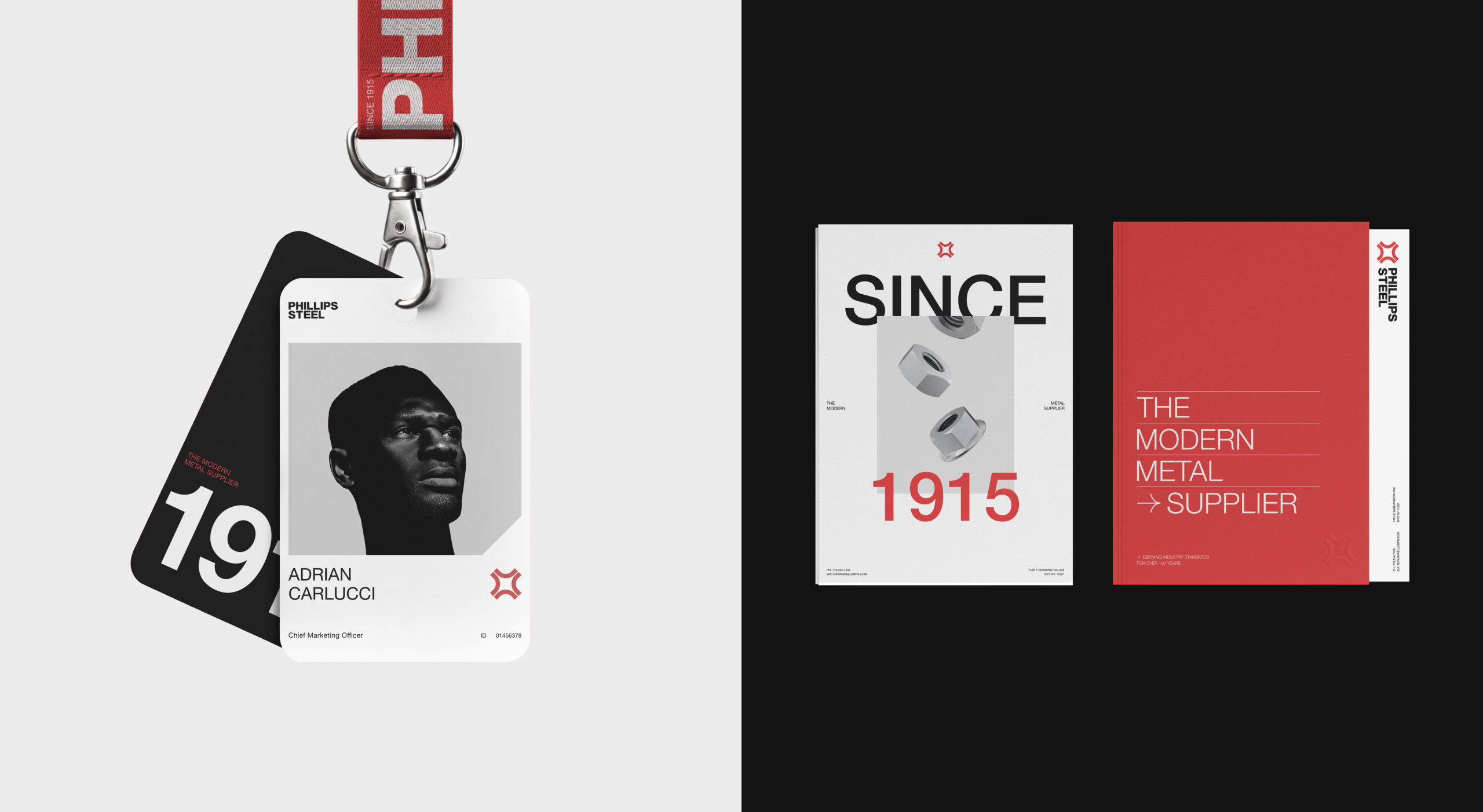
Industrial enough for steel. Built to outlast the trends.
The palette stayed in the family — the red and black they'd always owned — pulled toward cleaner, harder tones built to hold up for years. Type went the other way on purpose: Helvetica, bold, all caps. Nothing trend-driven to age out, just the most durable sans there is.
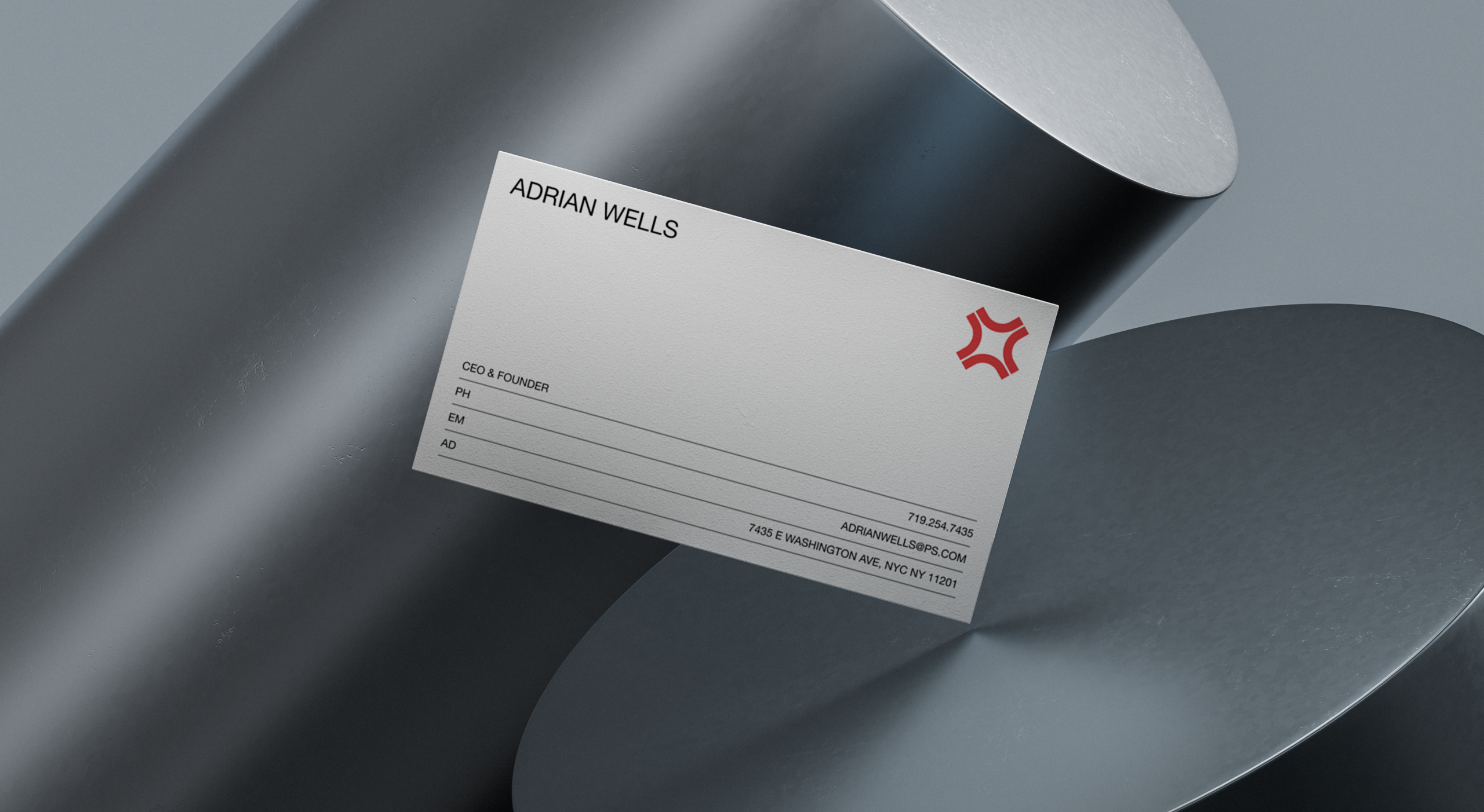
The same identity, from a business card to the building.
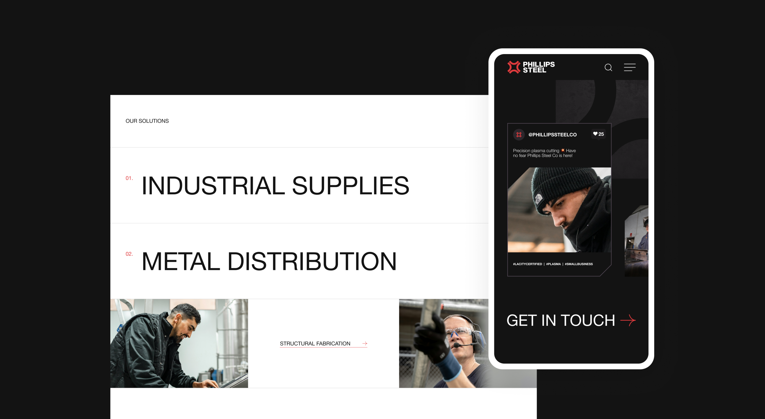
It landed. The identity now runs across everything Phillips Steel puts out — and it's been painted as a mural on the side of their corporate building. For a company that's stood since 1915, a mark worth putting on the building is about the right measure of a rebrand.